Lecture 3: Data reshaping and visualization#
“Data visualization”, “chart”, “graph”, and will be used interchangeably.
Please sign attendance sheet; close devices
Ensure the visualizations render properly across VSCode, Jupyter Book, etc. You can ignore this.
import plotly.io as pio

pio.renderers.default = "colab+notebook_connected+plotly_mimetype"
Example from first class#
import plotly.express as px

df = px.data.tips()
fig = px.scatter(df, x="total_bill", y="tip", trendline="ols")
fig.show()
This includes a trendline. Let’s take a look at the statistical summary, via the statsmodels package, following Plotly’s example:
trend_results = px.get_trendline_results(fig).iloc[0, 0]
trend_results.summary()
| Dep. Variable: | y | R-squared: | 0.457 |
|---|---|---|---|
| Model: | OLS | Adj. R-squared: | 0.454 |
| Method: | Least Squares | F-statistic: | 203.4 |
| Date: | Tue, 14 Apr 2026 | Prob (F-statistic): | 6.69e-34 |
| Time: | 17:28:13 | Log-Likelihood: | -350.54 |
| No. Observations: | 244 | AIC: | 705.1 |
| Df Residuals: | 242 | BIC: | 712.1 |
| Df Model: | 1 | ||
| Covariance Type: | nonrobust |
| coef | std err | t | P>|t| | [0.025 | 0.975] | |
|---|---|---|---|---|---|---|
| const | 0.9203 | 0.160 | 5.761 | 0.000 | 0.606 | 1.235 |
| x1 | 0.1050 | 0.007 | 14.260 | 0.000 | 0.091 | 0.120 |
| Omnibus: | 20.185 | Durbin-Watson: | 1.811 |
|---|---|---|---|
| Prob(Omnibus): | 0.000 | Jarque-Bera (JB): | 37.750 |
| Skew: | 0.443 | Prob(JB): | 6.35e-09 |
| Kurtosis: | 4.711 | Cond. No. | 53.0 |
Notes:
[1] Standard Errors assume that the covariance matrix of the errors is correctly specified.
“In general, the higher the R-squared, the better the model fits your data.”
In-class exercise#
Using NYC parks data, make a histogram of parks by borough. Pair with a neighbor.
Fertility rates demo#
What should we look at?
Reshaping#
Mapping#
Let’s make a map. What should it be?
Choropleth maps#
Geospatial data#
To make a choropleth map, we need shapes. We’ll use country boundaries as GeoJSON from Natural Earth.
The structure looks something like:
{
  "type": "FeatureCollection",
  "name": "ne_50m_admin_0_countries",
  "features": [
    {
      "type": "Feature",
      "properties": {
        "NAME": "Fiji",
        "ADM0_ISO": "FJI",
        ...
      },
      "bbox": [
        -180,
        -18.28799,
        180,
        -16.020882
      ],
      "geometry": {
        "type": "MultiPolygon",
        "coordinates": [
          [
            [
              [180, -16.067133],
              [180, -16.555217],
              ...
            ]
          ]
        ]
      }
    },
    ...
  ]
}
ADM0_ISO is the property we’re looking for. We’ll specify this as the featureidkey.
Fun fact (for a certain kind of person): What the zoom level means
Chart hygiene#
Always include a title
Make sure you label dependent and independent variables (X and Y axes)
Consider whether you are working with continuous vs. discrete values
If you’re trying to show more than three variables at once (e.g. X axis, Y axis, and color), try simplifying
What visualization should I use?#
Rudimentary guidelines:
What do you want to do? |
Chart type |
|---|---|
Show changes over time |
Line chart |
Compare values for categorical data |
Bar chart |
Compare two numeric variables |
Scatter plot |
Count things / show distribution across a range |
Histogram |
Show geographic trends |
The Data Design Standards goes into more detail.
Homework 3#
Final Project#
In real/ideal world, start with specific question and find data to answer it:
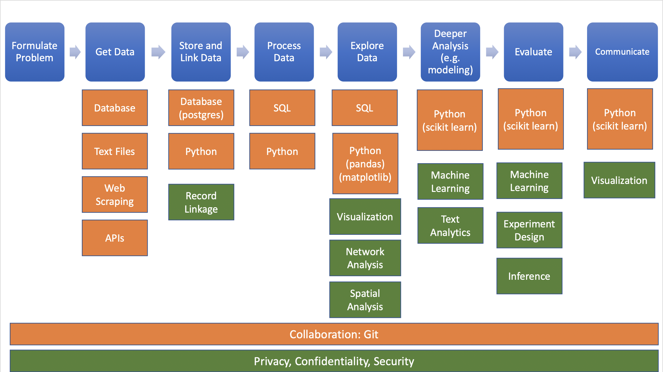
Source: Big Data and Social Science
Data needed often doesn’t exist or is hard (or impossible) to find/access