Homework 4#
General assignment information
Coding#
Goal: Find complaint types that increased or decreased when COVID-19 hit New York City in mid-March 2020.
Each step builds on one another, to simulate what the Final Project will be like. That said, if you get stuck on Steps 0-5, you can jump ahead and do Steps 6-7, since they don’t depend on previous Steps.
This notebook is specific with the DataFrame names to make troubleshooting easier.
Step 0: Setup#
For this homework, instead of the data being provided, you will export it directly from the NYC Open Data Portal, as if you were working on your own project.
Download the data.
Visit the 311 data page.
From that page, filter the data to
Created Dates between2020 Jan 01 12:00:00 AMand2020 Mar 31 11:59:59 PM.It should indicate that it’s around 548k rows.
Click
Export.Click
CSV. It will start downloading a file.Rename the file
311_covid.csv.
If the above is taking a long time due to have a slow network connection or whatever else, load the data from:
https://storage.googleapis.com/python-public-policy2/data/311_covid.csv.zip
Step 1: Load data#
Read the data into a DataFrame called df_2020.
# your code here
Step 2: Convert dates#
Copy code from Lecture 4 to convert the Created Date to a datetime.
# your code here
Step 3: Date counts#
Create a DataFrame called date_counts that has the count of complaints per Complaint Type per day, then display it.
# your code here
Step 4: Plotting over time#
Create a line chart of the count of complaints over time, one line per Complaint Type.
# your code here
This has the information we need, but is a lot to look at. Let’s only show complaint types that changed greatly (in March 2020) relative to the same period in the previous year (March 2019).
Step 5: March 2020 counts#
Create a DataFrame called mar_counts that has the count of each Complaint Type in March 2020 in a column called 2020. Use .to_frame() (instead of .reset_index()) to use the Complaint Type as the index. It should end up looking something like this:
Complaint Type |
2020 |
|---|---|
APPLIANCE |
824 |
Abandoned Vehicle |
2500 |
Adopt-A-Basket |
7 |
… |
… |
Note there is no numeric index.
# your code here
Step 6: Get March 2019 data#
Follow Steps 0-2 again, this time with 311 requests for all of March 2019. Name the DataFrame mar_2019.
Similar to Step 0, if having trouble downloading, you can load from:
https://storage.googleapis.com/python-public-policy2/data/311_mar_2019.csv.zip
# your code here
Step 7: March 2019 counts#
Get the
Complaint Typecounts for March 2019.Add these to the
mar_countsDataFrame as a column called2019.Reminder that adding a Series as a new column to a DataFrame matches rows based on the index.
# your code here
Step 8: Percent change#
Use mar_counts to calculate the percent change from March 2019 to March 2020 for each Complaint Type. Save as the pct_change column. Should result in something like this:
Complaint Type |
2020 |
2019 |
pct_change |
|---|---|---|---|
APPLIANCE |
824 |
1042 |
-0.20 |
Abandoned Vehicle |
2500 |
1 |
2499.00 |
Adopt-A-Basket |
7 |
NaN |
NaN |
… |
… |
… |
… |
# your code here
Step 9: Filter#
Filter to Complaint Types that both:
Occurred at least 50 times in March 2020
Changed (increased or decreased) by more than 90%
and save the DataFrame as top_changed. A couple of things that may be helpful:
Selecting Subsets of Data in Pandas, starting from “Multiple condition expression”
# your code here
Step 10: Top changed#
Filter the date_counts to only the top_changed Complaint Types. Save as top_changed_by_day.
# your code here
Step 11: Plotting changed complaints#
Make a similar plot to Step 4, but with only the top complaints (top_changed_by_day).
# your code here
Question 0#
Did the change of any of the Complaint Types in Step 10/11 surprise you? Why or why not? (Speak at least one specifically.)
YOUR RESPONSE HERE
Then, give these a read:
Overall caveat for this assignment: correlation does not imply causation.
Bonus: Charting against COVID-19 case counts#
10 points
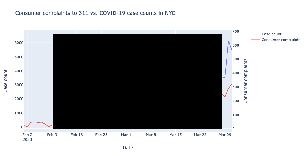
Let’s take a look at the Consumer Complaints against the COVID-19 case numbers in NYC in the same graph. You’ll need to:
Find data that provides the COVID-19 case counts for NYC by day.
Create a DataFrame with only the
Consumer ComplaintComplaint Typecounts, by day.Chart the two against each other for February through March.
The result should look something like this (without the black box):

Some resources that may be helpful:
-
Note that the
plotly.graph_objectssyntax is a bit different than theplotly.expresssyntax we’ve been using. Withgo.Scatter(), you don’t provide the DataFrame and the names of the columns; you passxandyas lists/Series of the values themselves.
# your code here
What observations do you have?#
YOUR RESPONSE HERE
Tutorials#
In the videos below, don’t get hung up on mentions of JavaScript, Node.js, or Twilio — those were technologies used for another course.
Watch:
Watch:
Read Python’s Requests Library (Guide) through
The Message Body
Participation#
Reminder about the between-class participation requirement.
