Class 3: Data visualization#
“Data visualization”, “chart”, “graph”, and will be used interchangeably.
Today’s goal: Visualizing requests per community district#
This should help us better understand trends across the city.
Start by importing necessary packages#
import pandas as pd
import plotly.express as px
Populations#
Load the data:
population = pd.read_csv("https://data.cityofnewyork.us/api/views/xi7c-iiu2/rows.csv")
population.head()
| Borough | CD Number | CD Name | 1970 Population | 1980 Population | 1990 Population | 2000 Population | 2010 Population | |
|---|---|---|---|---|---|---|---|---|
| 0 | Bronx | 1 | Melrose, Mott Haven, Port Morris | 138557 | 78441 | 77214 | 82159 | 91497 |
| 1 | Bronx | 2 | Hunts Point, Longwood | 99493 | 34399 | 39443 | 46824 | 52246 |
| 2 | Bronx | 3 | Morrisania, Crotona Park East | 150636 | 53635 | 57162 | 68574 | 79762 |
| 3 | Bronx | 4 | Highbridge, Concourse Village | 144207 | 114312 | 119962 | 139563 | 146441 |
| 4 | Bronx | 5 | University Hts., Fordham, Mt. Hope | 121807 | 107995 | 118435 | 128313 | 128200 |
Adapting the basic histogram example:
fig = px.histogram(
population,
x="Borough",
title="Number of community districts in each borough",
)
fig.show()
Histogram values are equivalent to doing a .groupby().size().
fig = px.histogram(
population,
x="2010 Population",
title="Distribution of Community District populations, 2010",
nbins=20,
)
fig.show()
Data from where we left off last class#
Derived dataset containing count of complaints per community district.
districts = pd.read_csv(
"https://storage.googleapis.com/python-public-policy2/data/community_district_311.csv.zip"
)
districts.head()
| Community Board | num_311_requests | boro_cd | Borough | CD Number | CD Name | 1970 Population | 1980 Population | 1990 Population | 2000 Population | 2010 Population | |
|---|---|---|---|---|---|---|---|---|---|---|---|
| 0 | 12 MANHATTAN | 14110 | 112 | Manhattan | 12 | Washington Heights, Inwood | 180561 | 179941 | 198192 | 208414 | 190020 |
| 1 | 05 QUEENS | 12487 | 405 | Queens | 5 | Ridgewood, Glendale, Maspeth | 161022 | 150142 | 149126 | 165911 | 169190 |
| 2 | 12 QUEENS | 12228 | 412 | Queens | 12 | Jamaica, St. Albans, Hollis | 206639 | 189383 | 201293 | 223602 | 225919 |
| 3 | 01 BROOKLYN | 11863 | 301 | Brooklyn | 1 | Williamsburg, Greenpoint | 179390 | 142942 | 155972 | 160338 | 173083 |
| 4 | 03 BROOKLYN | 11615 | 303 | Brooklyn | 3 | Bedford Stuyvesant | 203380 | 133379 | 138696 | 143867 | 152985 |
Looking at raw volume is probably less useful than density.
Calculate 311 requests per capita#
Divide request count by 2010 population to get requests per capita
districts["requests_per_capita"] = districts["num_311_requests"] / districts["2010 Population"]
districts.head()
| Community Board | num_311_requests | boro_cd | Borough | CD Number | CD Name | 1970 Population | 1980 Population | 1990 Population | 2000 Population | 2010 Population | requests_per_capita | |
|---|---|---|---|---|---|---|---|---|---|---|---|---|
| 0 | 12 MANHATTAN | 14110 | 112 | Manhattan | 12 | Washington Heights, Inwood | 180561 | 179941 | 198192 | 208414 | 190020 | 0.074255 |
| 1 | 05 QUEENS | 12487 | 405 | Queens | 5 | Ridgewood, Glendale, Maspeth | 161022 | 150142 | 149126 | 165911 | 169190 | 0.073805 |
| 2 | 12 QUEENS | 12228 | 412 | Queens | 12 | Jamaica, St. Albans, Hollis | 206639 | 189383 | 201293 | 223602 | 225919 | 0.054126 |
| 3 | 01 BROOKLYN | 11863 | 301 | Brooklyn | 1 | Williamsburg, Greenpoint | 179390 | 142942 | 155972 | 160338 | 173083 | 0.068539 |
| 4 | 03 BROOKLYN | 11615 | 303 | Brooklyn | 3 | Bedford Stuyvesant | 203380 | 133379 | 138696 | 143867 | 152985 | 0.075922 |
Let’s create a simplified new dataframe that only include the columns we care about and in a better order.
columns = [
"boro_cd",
"Borough",
"CD Name",
"2010 Population",
"num_311_requests",
"requests_per_capita",
]
cd_data = districts[columns]
cd_data
| boro_cd | Borough | CD Name | 2010 Population | num_311_requests | requests_per_capita | |
|---|---|---|---|---|---|---|
| 0 | 112 | Manhattan | Washington Heights, Inwood | 190020 | 14110 | 0.074255 |
| 1 | 405 | Queens | Ridgewood, Glendale, Maspeth | 169190 | 12487 | 0.073805 |
| 2 | 412 | Queens | Jamaica, St. Albans, Hollis | 225919 | 12228 | 0.054126 |
| 3 | 301 | Brooklyn | Williamsburg, Greenpoint | 173083 | 11863 | 0.068539 |
| 4 | 303 | Brooklyn | Bedford Stuyvesant | 152985 | 11615 | 0.075922 |
| 5 | 501 | Staten Island | Stapleton, Port Richmond | 175756 | 11438 | 0.065079 |
| 6 | 407 | Queens | Flushing, Bay Terrace | 247354 | 11210 | 0.045320 |
| 7 | 305 | Brooklyn | East New York, Starrett City | 182896 | 10862 | 0.059389 |
| 8 | 204 | Bronx | Highbridge, Concourse Village | 146441 | 10628 | 0.072575 |
| 9 | 401 | Queens | Astoria, Long Island City | 191105 | 10410 | 0.054473 |
| 10 | 317 | Brooklyn | East Flatbush, Rugby, Farragut | 155252 | 10208 | 0.065751 |
| 11 | 314 | Brooklyn | Flatbush, Midwood | 160664 | 10179 | 0.063356 |
| 12 | 207 | Bronx | Bedford Park, Norwood, Fordham | 139286 | 9841 | 0.070653 |
| 13 | 318 | Brooklyn | Canarsie, Flatlands | 193543 | 9717 | 0.050206 |
| 14 | 409 | Queens | Woodhaven, Richmond Hill | 143317 | 9599 | 0.066977 |
| 15 | 413 | Queens | Queens Village, Rosedale | 188593 | 9459 | 0.050156 |
| 16 | 212 | Bronx | Wakefield, Williamsbridge | 152344 | 9412 | 0.061781 |
| 17 | 311 | Brooklyn | Bensonhurst, Bath Beach | 181981 | 9309 | 0.051154 |
| 18 | 205 | Bronx | University Hts., Fordham, Mt. Hope | 128200 | 9094 | 0.070936 |
| 19 | 103 | Manhattan | Lower East Side, Chinatown | 163277 | 8905 | 0.054539 |
| 20 | 408 | Queens | Fresh Meadows, Briarwood | 151107 | 8661 | 0.057317 |
| 21 | 304 | Brooklyn | Bushwick | 112634 | 8639 | 0.076700 |
| 22 | 110 | Manhattan | Central Harlem | 115723 | 8592 | 0.074246 |
| 23 | 503 | Staten Island | Tottenville, Woodrow, Great Kills | 160209 | 8524 | 0.053206 |
| 24 | 315 | Brooklyn | Sheepshead Bay, Gerritsen Beach | 159650 | 8508 | 0.053292 |
| 25 | 410 | Queens | Ozone Park, Howard Beach | 122396 | 8333 | 0.068082 |
| 26 | 312 | Brooklyn | Borough Park, Ocean Parkway | 191382 | 8214 | 0.042919 |
| 27 | 107 | Manhattan | West Side, Upper West Side | 209084 | 8141 | 0.038937 |
| 28 | 209 | Bronx | Soundview, Parkchester | 172298 | 8092 | 0.046965 |
| 29 | 310 | Brooklyn | Bay Ridge, Dyker Heights | 124491 | 7808 | 0.062719 |
| 30 | 308 | Brooklyn | Crown Heights North | 96317 | 7797 | 0.080951 |
| 31 | 302 | Brooklyn | Brooklyn Heights, Fort Greene | 99617 | 7747 | 0.077768 |
| 32 | 309 | Brooklyn | Crown Heights South, Wingate | 98429 | 7571 | 0.076918 |
| 33 | 306 | Brooklyn | Park Slope, Carroll Gardens | 104709 | 7373 | 0.070414 |
| 34 | 502 | Staten Island | New Springville, South Beach | 132003 | 7059 | 0.053476 |
| 35 | 403 | Queens | Jackson Heights, North Corona | 171576 | 6799 | 0.039627 |
| 36 | 109 | Manhattan | Manhattanville, Hamilton Heights | 110193 | 6792 | 0.061637 |
| 37 | 104 | Manhattan | Chelsea, Clinton | 103245 | 6765 | 0.065524 |
| 38 | 105 | Manhattan | Midtown Business District | 51673 | 6599 | 0.127707 |
| 39 | 108 | Manhattan | Upper East Side | 219920 | 6579 | 0.029915 |
| 40 | 102 | Manhattan | Greenwich Village, Soho | 90016 | 6514 | 0.072365 |
| 41 | 211 | Bronx | Pelham Pkwy, Morris Park, Laconia | 113232 | 6448 | 0.056945 |
| 42 | 307 | Brooklyn | Sunset Park, Windsor Terrace | 126230 | 6364 | 0.050416 |
| 43 | 402 | Queens | Sunnyside, Woodside | 113200 | 6142 | 0.054258 |
| 44 | 404 | Queens | Elmhurst, South Corona | 172598 | 5824 | 0.033743 |
| 45 | 208 | Bronx | Riverdale, Kingsbridge, Marble Hill | 101731 | 5753 | 0.056551 |
| 46 | 411 | Queens | Bayside, Douglaston, Little Neck | 116431 | 5748 | 0.049368 |
| 47 | 206 | Bronx | East Tremont, Belmont | 83268 | 5746 | 0.069006 |
| 48 | 210 | Bronx | Throgs Nk., Co-op City, Pelham Bay | 120392 | 5719 | 0.047503 |
| 49 | 111 | Manhattan | East Harlem | 120511 | 5714 | 0.047415 |
| 50 | 414 | Queens | The Rockaways, Broad Channel | 114978 | 5284 | 0.045957 |
| 51 | 203 | Bronx | Morrisania, Crotona Park East | 79762 | 5262 | 0.065971 |
| 52 | 106 | Manhattan | Stuyvesant Town, Turtle Bay | 142745 | 5158 | 0.036134 |
| 53 | 316 | Brooklyn | Brownsville, Ocean Hill | 86468 | 5100 | 0.058981 |
| 54 | 201 | Bronx | Melrose, Mott Haven, Port Morris | 91497 | 4915 | 0.053718 |
| 55 | 406 | Queens | Forest Hills, Rego Park | 113257 | 4607 | 0.040677 |
| 56 | 313 | Brooklyn | Coney Island, Brighton Beach | 104278 | 3840 | 0.036825 |
| 57 | 101 | Manhattan | Battery Park City, Tribeca | 60978 | 3623 | 0.059415 |
| 58 | 202 | Bronx | Hunts Point, Longwood | 52246 | 3470 | 0.066417 |
Let’s check out which Community Districts have the highest complaints per capita
cd_data.sort_values("requests_per_capita", ascending=False).head(10)
| boro_cd | Borough | CD Name | 2010 Population | num_311_requests | requests_per_capita | |
|---|---|---|---|---|---|---|
| 38 | 105 | Manhattan | Midtown Business District | 51673 | 6599 | 0.127707 |
| 30 | 308 | Brooklyn | Crown Heights North | 96317 | 7797 | 0.080951 |
| 31 | 302 | Brooklyn | Brooklyn Heights, Fort Greene | 99617 | 7747 | 0.077768 |
| 32 | 309 | Brooklyn | Crown Heights South, Wingate | 98429 | 7571 | 0.076918 |
| 21 | 304 | Brooklyn | Bushwick | 112634 | 8639 | 0.076700 |
| 4 | 303 | Brooklyn | Bedford Stuyvesant | 152985 | 11615 | 0.075922 |
| 0 | 112 | Manhattan | Washington Heights, Inwood | 190020 | 14110 | 0.074255 |
| 22 | 110 | Manhattan | Central Harlem | 115723 | 8592 | 0.074246 |
| 1 | 405 | Queens | Ridgewood, Glendale, Maspeth | 169190 | 12487 | 0.073805 |
| 8 | 204 | Bronx | Highbridge, Concourse Village | 146441 | 10628 | 0.072575 |
While Inwood (112) had the highest number of complaints, it ranks further down on the list for requests per capita. Midtown may also be an outlier, based on it’s low residential population.
# cd_data.to_csv("data/311_community_districts.csv", index=False)
In-class exercise#
How does the per-capita distribution compare to that of the raw counts?
fig = px.histogram(districts, x="requests_per_capita", height=200)
fig.show()
fig = px.histogram(districts, x="num_311_requests", height=200)
fig.show()
Let’s improve the formatting (based on the .histogram() documentation):
fig = px.histogram(
districts,
x="requests_per_capita",
title="Volume of 311 requests, 2018-2019",
labels={"requests_per_capita": "311 requests per capita"},
)
# y-axis needs to be done separately, since it's derived
fig.update_layout(yaxis_title_text="Number of community districts")
fig.show()
Scatterplot#
fig = px.scatter(
districts,
x="2010 Population",
y="num_311_requests",
title="Number of 311 requests per Community District by population",
)
fig.show()
fig = px.scatter(
districts,
x="2010 Population",
y="num_311_requests",
title="Number of 311 requests per Community District by population",
trendline="ols",
)
fig.show()
Let’s take a look at the statistical summary, via the statsmodels package, following Plotly’s example:
trend_results = px.get_trendline_results(fig).iloc[0, 0]
trend_results.summary()
| Dep. Variable: | y | R-squared: | 0.469 |
|---|---|---|---|
| Model: | OLS | Adj. R-squared: | 0.460 |
| Method: | Least Squares | F-statistic: | 50.39 |
| Date: | Mon, 18 Mar 2024 | Prob (F-statistic): | 2.18e-09 |
| Time: | 17:43:34 | Log-Likelihood: | -523.81 |
| No. Observations: | 59 | AIC: | 1052. |
| Df Residuals: | 57 | BIC: | 1056. |
| Df Model: | 1 | ||
| Covariance Type: | nonrobust |
| coef | std err | t | P>|t| | [0.025 | 0.975] | |
|---|---|---|---|---|---|---|
| const | 2692.4746 | 773.994 | 3.479 | 0.001 | 1142.578 | 4242.371 |
| x1 | 0.0379 | 0.005 | 7.099 | 0.000 | 0.027 | 0.049 |
| Omnibus: | 0.047 | Durbin-Watson: | 1.999 |
|---|---|---|---|
| Prob(Omnibus): | 0.977 | Jarque-Bera (JB): | 0.080 |
| Skew: | -0.052 | Prob(JB): | 0.961 |
| Kurtosis: | 2.853 | Cond. No. | 4.88e+05 |
Notes:
[1] Standard Errors assume that the covariance matrix of the errors is correctly specified.
[2] The condition number is large, 4.88e+05. This might indicate that there are
strong multicollinearity or other numerical problems.
“In general, the higher the R-squared, the better the model fits your data.”
Map complaint counts by CD#
We’ll follow this example, using community district GIS data.
Jump ahead to the map
First, let’s take a look at the GeoJSON data. We’re looking for what we can match our boro_cd column up to. One way to inspect it:
Open Chrome
Install JSON Viewer
Open https://data.cityofnewyork.us/resource/jp9i-3b7y.geojson
Load the GeoJSON data using the requests package (nothing to do with 311 requests):
import requests
response = requests.get("https://data.cityofnewyork.us/resource/jp9i-3b7y.geojson")
shapes = response.json()
print("loaded")
# intentionally not outputting the data here since it's large
loaded
This is equivalent to the use of urlopen() and json.load() in the Plotly examples.
The structure looks something like:
{
"type": "FeatureCollection",
"features": [
{
"type": "Feature",
"geometry": {
"type": "MultiPolygon",
"coordinates": [
[
[
[-73.8718461029101, 40.843760777855834],
…
]
]
]
},
"properties": {
"boro_cd": "206",
"shape_leng": "35875.7117328",
"shape_area": "42664311.5086"
}
},
…
]
}
Peek at the properties of one of the features a.k.a. shapes a.k.a. Community Districts:
shapes["features"][0]["properties"]
{'boro_cd': '308',
'shape_leng': '38232.8866493',
'shape_area': '45603787.1384'}
Notes:
boro_cdis the property we’re looking for. We’ll specify this as thefeatureidkey.response.json()turns JSON data into nested Python objects:shapesis a dictionary,featuresis a list beneath it, etc.
def plot_nyc(df):
fig = px.choropleth_mapbox(
df,
locations="boro_cd", # column name to match on
color="requests_per_capita", # column name for values
geojson=shapes,
featureidkey="properties.boro_cd", # GeoJSON property to match on
center={"lat": 40.71, "lon": -73.98},
zoom=9,
mapbox_style="carto-positron",
height=600,
title="Requests per capita across Community Districts",
)
fig.show()
Wrapping this Plotly code in a function to:
Save space on subsequent slides
Make the code reusable for plotting different DataFrames
plot_nyc(districts)
Midtown, as an outlier, is skewing our results. Let’s exclude it.
no_midtown = districts[districts["boro_cd"] != 105]
plot_nyc(no_midtown)
Fun fact (for a certain kind of person): What the Mapbox zoom level means
Chart hygiene#
Always include a title
Make sure you label dependent and independent variables (X and Y axes)
Consider whether you are working with continuous vs. discrete values
If you’re trying to show more than three variables at once (e.g. X axis, Y axis, and color), try simplifying
What visualization should I use?#
Rudimentary guidelines:
What do you want to do? |
Chart type |
|---|---|
Show changes over time |
Line chart |
Compare values for categorical data |
Bar chart |
Compare two numeric variables |
Scatter plot |
Count things / show distribution across a range |
Histogram |
Show geographic trends |
The Data Design Standards goes into more detail.
Pivoting#
FYI: Pandas supports reshaping DataFrames through pivoting, like spreadsheets do.
Homework 3#
Final Project#
In real/ideal world, start with specific question and find data to answer it:
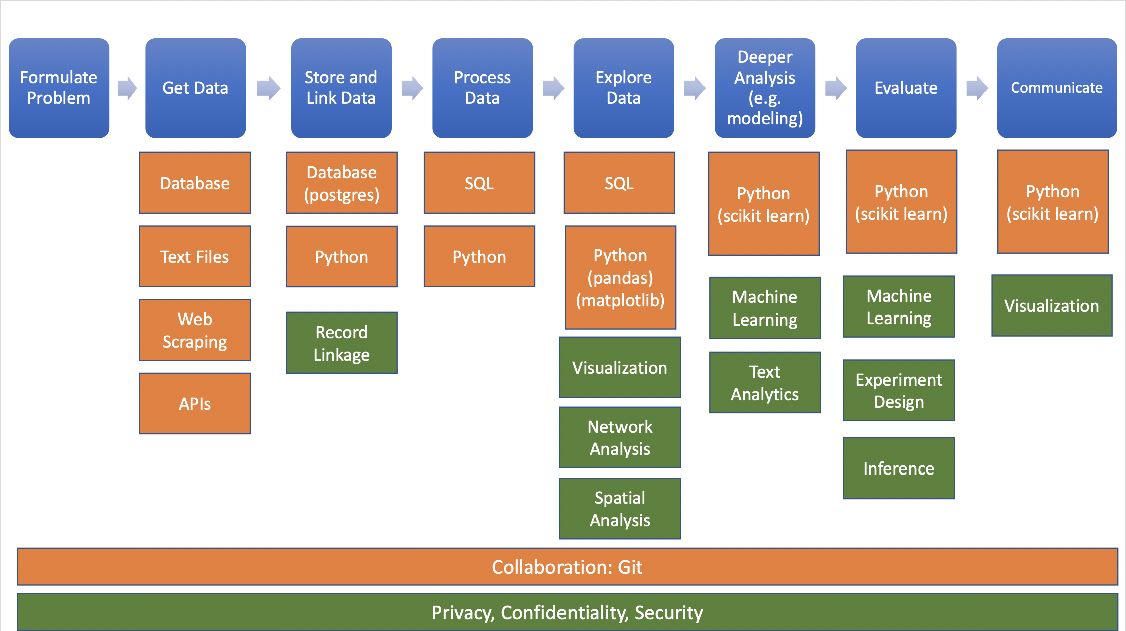
Source: Big Data and Social Science
Data needed often doesn’t exist or is hard (or impossible) to find/access